El Dorado
Crafting a luxury brand rooted in legacy
BRAND IDENTITY
GRAPHIC DESIGN
Table Of Contents
The Problem
El Dorado wasn’t just another sea-facing project in Worli. It was envisioned as an ultra-luxury, aspirational address.
The challenge wasn’t just to design a brand, but to create an identity that could stand alongside global luxury developments.
Our Direction
We aligned the brand with a clear ambition: build El Dorado as a globally inspired luxury identity, not just a local real estate project. That direction was shaped by studying premium developments in markets like Dubai, anchoring the brand in the El-Dorado legend itself, and creating an identity that feels exclusive, timeless, and aspirational.
Insight
Luxury is not communicated through excess. It is built through restraint and recognisable cues. We identified that strong luxury brands rely on distinct mnemonics, minimal typography enhances premium perception, and colour plays a key role in emotional positioning.
The brand needed a visual system, not just a logo.
Our Execution
Inspired by the mythology of El Dorado, we built a cohesive identity:
- Introduced a gold-led colour palette to reflect richness and legacy
- Paired it with deep maroon to enhance depth and luxury
- Designed a minimal, refined typeface for timeless appeal
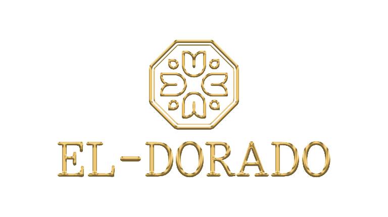
- Created a distinct mnemonic: a hexagonal floral form that subtly reveals “E” and “D” from multiple angles
This system extended across branding collaterals, marketing materials, and facade applications.
Every touchpoint reinforced one consistent luxury language.